The COOL Cooperative
Brand Identity, Brand Voice, Content Strategy, Content Templates
The COOL Cooperative is a local 501(c)(3) organization in New Orleans dedicated to helping inner-city youth with film-industry specific workforce development. “COOL” stands for Creating Outstanding Opportunities Locally. They offer summer programs, after-school programs, and hands-on training in film production.
The tasks:
Take their existing logo and evolve it into something new. The new logo should be appropriate (pertaining to the brand’s identity and purpose), distinct (unique), and simple (easily replicated and used).
Create a brand voice for COOL that their team can use to sound consistent across their social media, website, and all other materials.
Craft a content strategy for COOL that gives them ideas of ways to use social media to engage their current students and parents, intrigue outside students and parents, and entice donors by demonstrating their positive effect on youth.
Build a style guide and content templates for COOL, using the new logo, to help them achieve visual cohesion. Translate these templates in Canva so anyone on their internal team can use them.
Task 1: The Logo
This was The COOL Cooperative’s existing logo. While it conveys the idea of “film production”, it’s quite busy and hard to follow with the eye. There is superfluous copy, and many different fonts and design elements that distract from the purpose. The design feels dated and doesn’t replicate well at small sizes. However, the client did state that they like that the logo appeals to film as a concept and they like that there is a speech bubble that implies action, communication, and learning.
Solution 1: The New Logo
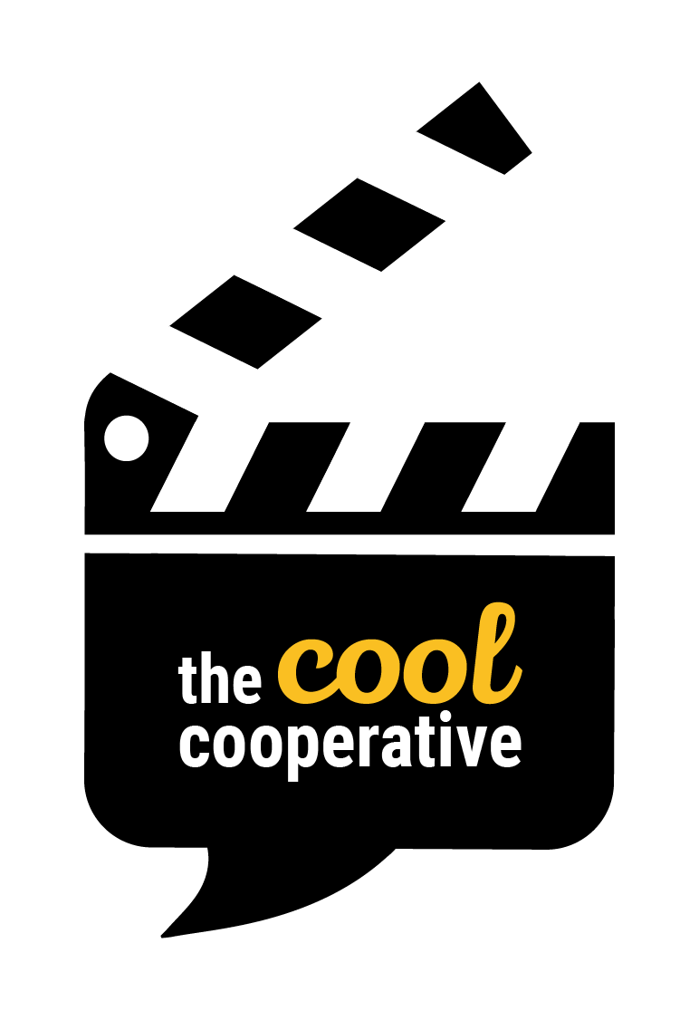
After working with the client on several logo options, we landed on this logo. I created this logo with the idea of preserving their existing brand, while creating something more simple and timeless than their old logo. I combined the clapperboard shape and the speech bubble to make a distinct shape that would speak to both the educational and film aspects of the program. White space separates the speech bubble from the top of the clapperboard, allowing the eye to take in the elements separately and together. Also, now that all the logo elements are contained within the clapperboard shape, the mark can be used easily across different mediums and scales nicely.
Knowing that The COOL Cooperative is a non-profit that focuses on film production, it was only fitting to creative them an animated version of the logo that they and their students could use in their films for branding.
Task and Solution 2: Brand Voice
Following an intensive workshop with the client, I developed a brand voice using both client inputs and intuition about what tone would resonate with both students, parents, and donors. I settled on calling this persona “Uncle Cool”, a funcle who loves film, embraces social issues, and loves to inspired creativity in young people. These are a few slide excerpts from the deck I created establishing this brand voice.


Task and Solution 3: Content Strategy
This content strategy has three main pillars: education, features, and entertainment. Education both makes a case for the purpose of after school programs like COOL, and enlightens students or other curious minds on the inner workings of the film industry. Features is all about inspiring creativity and inciting passion, featuring series like spotlights on local NOLA film crews and donor quotes. Entertainment is for the pure fun and delight of social media, giving film recos and spotlighting black joy (as the majority of COOL students are black). Most importantly, all of these content ideas seemed to open up the client’s mind to the possibilities of how they could use their social channel to increase their capital as a brand, and therefore their positive effect on youth. Shown below are a few slide excerpts from the content strategy deck.


Task and Solution 4: Content Templates
During the visual workshop with the client, they requested bright New Orleans colors, fun youthful energy, and a general appeal to film production. I translated these requests into a style guide and a series of Canva templates they could easily apply to posts to ensure their branding was consistent but still varied.


